pounce
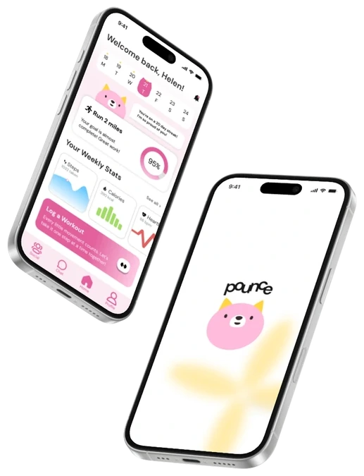
Pounce is a community-powered fitness app that helps people stay consistent and build healthy habits through shared goals, tracking, and a mascot that grows with them.
4 min read
overview
at a glance
How might we design a fitness experience that keeps people motivated to track, plan, and celebrate their progress?
Fitness apps lose people once the novelty wears off, and tracking starts to feel like an isolating chore. We designed Pounce around community instead: people log activity, join Crew Challenges with friends, and get encouragement from Pounce, a cat mascot who turns tracking and AI insights into a friendly conversation.
key decisions
giving the mascot a job
In usability testing, everyone finished both tasks and loved Pounce, but many couldn't say what the mascot was for. A cute character without a purpose was just decoration.
"The concept is really cute, but as a first-time user I wasn't sure where to begin or how Pounce connected to the experience."
— usability test participant
So we gave Pounce a job: it now grows and levels up alongside your fitness journey, which gives people a clear reason to keep logging and come back.
stats up front
Testers also struggled to find their progress. We surfaced key stats on the primary screens, simplified layouts, and cut the steps to the features people used most.
the final screens
team & process
As design lead, I owned the project strategy and timeline, kept design decisions aligned across the team, and designed the Create Workout pages myself. When one of our five designers left late in the sprint, we restructured the workload and still delivered the final designs.
an 8-week sprint
- 01research
- 02ideation
- 03lo-fi
- 04mid-fi
- 05testing
- 06hi-fi
- 07handoff
user research
People weren't asking for more features. They wanted less of a productivity tool and more of a supportive companion, and they were tired of dark, cluttered interfaces. Popular apps like Strava and MyFitnessPal offered clear goals and strong communities, but felt demanding or intimidating to beginners.
survey highlights
ideation & mid-fi
We clustered our findings in an affinity map, built personas for casual exercisers and beginners, and used a feature matrix to keep only what fit an 8-week sprint. Clinical, metrics-heavy layouts felt cold, so the mascot became part of every screen, from onboarding to the AI chat.
In grayscale mid-fi wireframes we tested structure before style: bite-sized onboarding cards instead of long forms, a home screen with clear zones for progress and goals, and Crew Challenge cards built around group progress rather than competition.
design system
Typography — DM Sans, clean and modern with some personality.
Color — A playful mix of pink, blue, yellow, white, and black that reflects the energy of working out with friends.
Components — Rounded buttons, icons, and cards that feel welcoming to new users.
presentation & next steps
We presented to three industry judges: Chris Ota (LinkedIn), Ken Skistimas (ServiceNow), and Aditi Jain (Computrition). Ken praised the color scheme and mascot for making Pounce feel beginner-friendly, and asked what Pounce would look like if its AI ran through the whole app.
next steps
Deepen the mascot — Map Pounce's growth stages to real milestones like streaks and finished Crew Challenges.
Contextual AI everywhere — Turn the chatbot into a companion that writes personal encouragement on the home screen.
Beyond the phone — Smartwatch and home-screen widgets for logging at a glance.